Output
Design System & Micro-interactions
TLDR: We completed an ambitious redesign of Output’s website, including a robust design system and well-documented, complex micro-interactions.
My involvement
As the sole product designer on this project, I abstracted the working files created by a marketing designer into a design system, refactored several components for efficiency, created intricate micro-interactions (After Effects/Principle/Framer), created a component-based documentation system for handing off motion design, and worked with developers to fully realize my designs.
Redesigns: they're so hot right now
Despite having a reputation within the music industry for its innovative UI design, Output's website hadn't been redesigned since 2017. In 2020, it was time to bring the site in-line with the first-in-class design treatments featured in Arcade, Output's flagship SaaS product.
In addition, this was the first time that Output's website would be codified into a UI Kit and Design System, which required extensive refactoring of components in order to standardize and optimize them for use across future projects.
Process & Experience
Micro-interactions
Because I joined the company well after this project began, I was not present for the early stages of the design process. Instead, I was hired as an interaction design specialist, creating micro-interaction prototypes in Principle. I've included a couple of them here.
This section serves to highlight key product features. It was designed to be re-skinnable, matching the sub-brand for any of our plugins.
Handoff
The tool I chose for these prototypes (Principle) had no handoff capabilities to speak of, and so I needed a method to communicate easing, duration, and target layers to engineers. On a shoestring budget, I first attempted to manually document everything in a Notion doc. This worked well enough, and was appreciated. However, it lacked any sort of timeline visualization, which is essential for a high-level view of any animation.
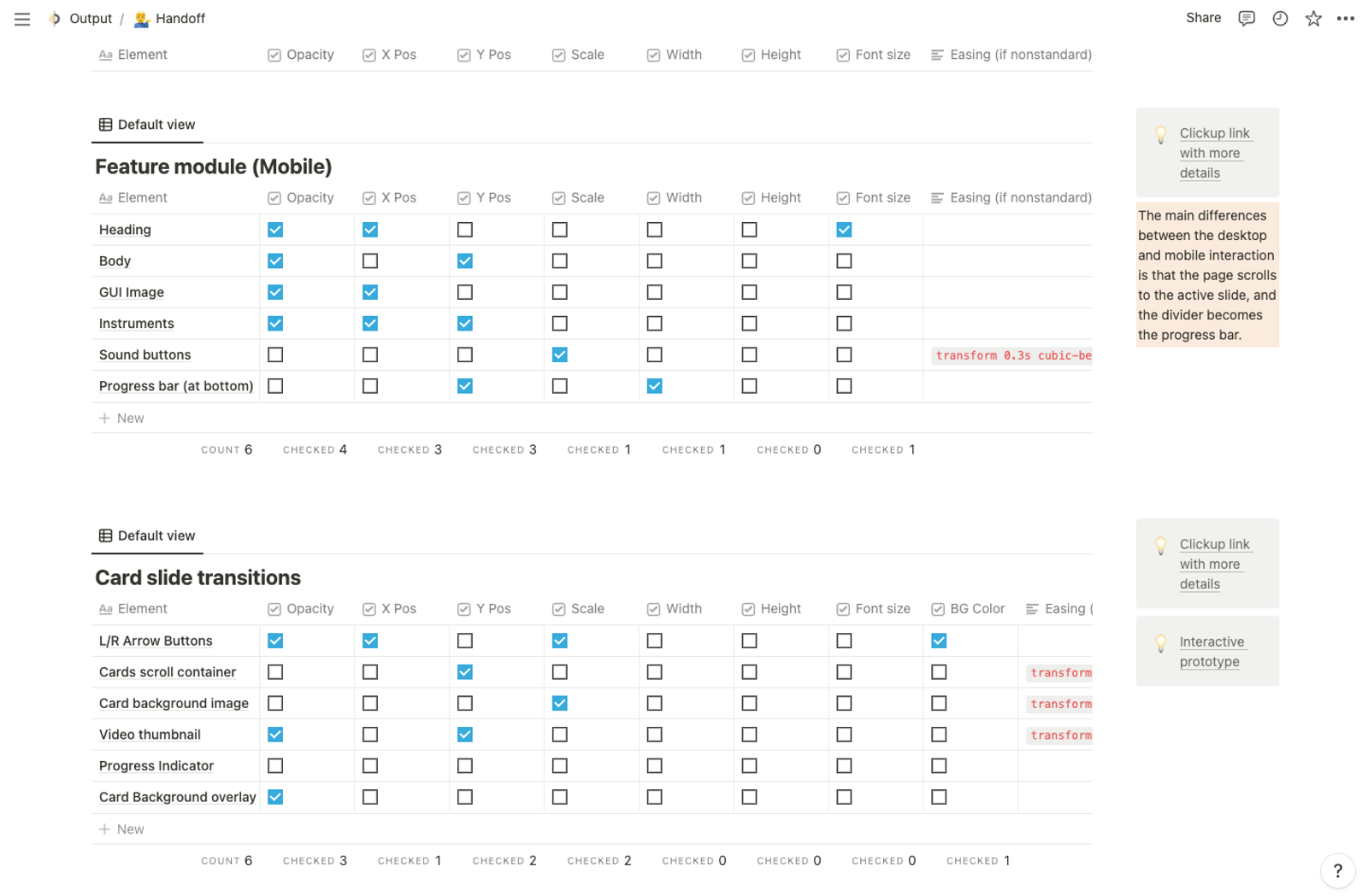
Unsatisfied with any of the existing options, I rolled my own documentation system for motion design handoff. It gives a birds-eye view of the timeline, along with easing, duration, target layers, anchor points, and more.
Design System
In between whipping up prototypes, I spent my time structuring and fleshing out the Output.com Design System. This involved:
- Remaking certain Figma components which were designed in Photoshop before this project was aimed to pilot a design system
- Refactoring existing components for efficiency and (re)usability
- Writing documentation for the components (usage, interaction details, etc)
- Creating the IA structure / naming convention for the components within Figma
- Reviewing this structure with stakeholders and developers to gain consensus at each step along the way
Key Learnings
The chosen tool can save (or cause) a ton of headaches
My previous work had been in AE and its outputs were videos. Handoff wasn't a major concern in those jobs, and so I tended towards tools with similar workflows. This forced me to manually document each layer's animation, duration, and easing. Thankfully, there are numerous tools to further automate and streamline this process nowadays.
Best practices for component creation
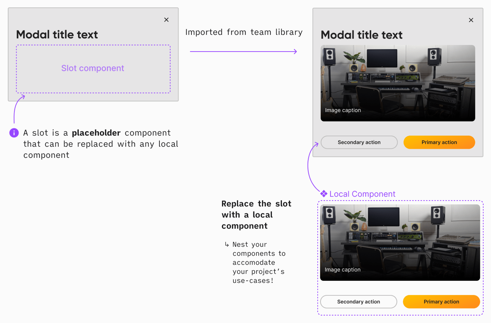
I learned a ton about how best to structure my components; for example, the use of Slot components wherever possible. These allow for easy composability by designers in their respective files, while also minimizing hidden layers, which would otherwise clutter up the layer panel.
Slot components are kind of a game changer.
Have I mentioned how much I love slot components? They minimize sources of truth while using an under-leveraged Figma feature (replacing nested library components with local components) to retain flexibility. This means that main components can be used merely as scaffolding. They no longer need to contain all potential layouts or sub-components; the designers on any project using the main component can compose them as they see fit.
Atomic Design had major pain points
Based on my assessment of the design system status quo, Output's design system was structured in accordance with Atomic Design. Elements began on the Atoms page, at their simplest (colors, typography, etc). The Molecules page contained elements comprised of Atoms (buttons, cards, navigation, etc). Finally, the Organisms page held our most complex constructions (entire pages, significantly complex modules, etc).
While logical, this system had a few serious issues:
- With only three levels of page-level organization, each page contained 10-50+ frames, each with multiple component types and variations. This was daunting to new designers and engineers.
- The Molecules page became a muddy middle-ground, with a high variance of component complexity. This made it less useful as a category.
- Containing our most complex components in Organisms was more than Figma could handle, and library load times crept up steadily, slowing down work.
We took what worked from Atomic Design, and ditched what didn't.
A flatter hierarchy was better for our organization
The trifecta of pain points above led me to bring several designers and engineers together and form a Design Systems Working Group, where we agreed upon a flatter structure. We took what worked from Atomic Design, and ditched what didn't. We still divvied pages up into Foundations and Components via cosmetic divider pages, but split out the frames within the 3 atomic pages into a page per component type. This crowded out some of our more complex modules and pages, which found their home in project-specific Figma documents.
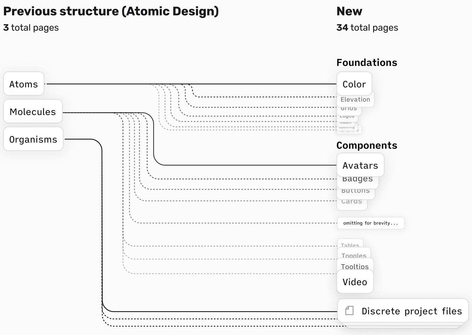
The result is a file with more robust structure, and it was extremely well received internally!
Words from my collaborators on this project

As a developer working on animations, transitions, and user interfaces, one of the greatest things that can happen is to collaborate with a designer as passionate, thorough, and communicative as Mordechai.
During the Output.com redesign, beyond providing prototypes illustrating the desired animations and transitions, a detailed motion spec was delivered that visually demonstrated the various positions, triggers, timelines, and timing functions that were required.
This played a major role in creating a smooth development experience for us, and an end product that matched our stakeholders expectations.
Looking for more than a highly abbreviated case study?
Thanks for reading this far. Let's dig in deeper.
Get in touchMore work
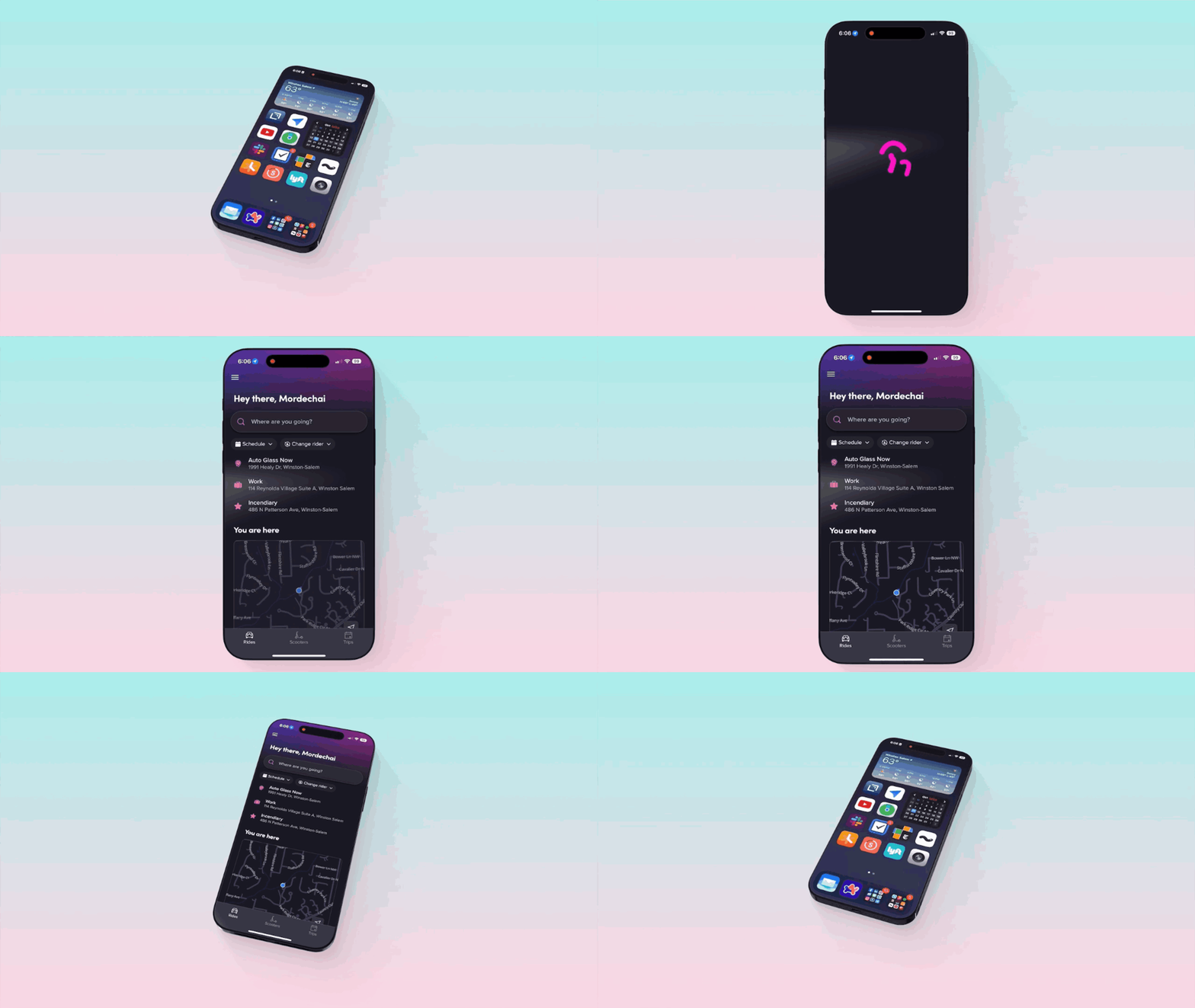
App Launch Animation
TLDR: In four weeks, I defined the scope, creative direction, and success metrics for a delightful app launch animation from an initially ambiguous request. I drove quick alignment across 10 stakeholders through daily comms, iterations, leading meetings and workshops.
Dev Mode Pilot
TLDR: I ran a large, cross-functional Dev Mode pilot at Lyft, demonstrating ~8k engineering hours / ~2.7k design hours saved per year. As a result, Dev Mode seats are now available to all front-end engineers at Lyft.